If you’ve perused our Youtube channel lately you’re most likely aware of the GAMEOLOGY series I’ve been doing with Attila Gabriel, the prodigal game developer behind BluishGreenProductions. If not, it’s a weekly show that takes a deep dive into various aspects of game design from both the aspect of player and designer. It’s also available on iTunes for your audio podcatching pleasure.
On the last episode we talked about session length. The current gaming landscape currently has an incredibly vast range of optimal session times. From engrossing console/PC experiences that can be enjoyed for several hours (or more) to a mobile game designed for 30 seconds of distraction. It’s more important than ever for developers to design the experience with session length in mind.
UI is an often underrated but extremely important aspect of game design, as it’s the first contact a player has with the game. I often use an example from my radio days when advising to avoid the ‘kitchen sink’ mentality. Every radio programmer was asked to design their own 15 or 30 second ads for their show. When presented with a blank slate and a huge tool chest, many DJs would create the most epic 30 seconds of radio advertisement in the history of the universe. This method definitely sounds interesting in a vaccuum, but you have to think in the context of a listener. Your audience has tuned in to hear music or chat, and ads are the enemy, taking them out of the immersion of whichever show they’re currently engaged with. A much better ad has zero background music, a pleasing voice (no vocal effects or pitch bending) and respects the listener’s time.
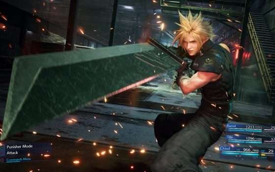
This applies extremely well to gaming menus, title screens, and any other non-game part of the experience. Sure a flashy title sequence with CGI and explosions is fun to watch once, but isn’t the point to get a gamer to play your product dozens if not hundreds of times? They’ll be skipping your expensive intro and most likely annoyed by the extra loading time. Another example is the interface in any genre that has a lot of menu navigation, like sports or RPGs. If the gamer will be spending a large chunk of time tweaking their roster or items/magic etc, they will want that interface to move as fast as possible. Loading a beautiful image of a potion in your inventory may seem like a great idea at first, but when sorting through 25 different varieties, it bogs the experience down.
For handhelds or mobile, game design must take into account the shorter play sessions. A 25 minute cut scene may work for Metal Gear Solid IV while sitting on the couch, but on the Vita for example, it makes it near impossible to whip it out for a quick play session while waiting in line to pay for groceries. If Otacon is half way through his 18th monologue about war and love, I don’t want to skip it or (even worse) have to watch it from the beginning again.
It all comes down to context and how elements work as a whole. Keep in mind the context that each aspect will be experienced and you’ll have a better overall product.


